Overview
The Contact Page module (left sidebar of the Knocket console) is where you build the shareable page you drop into your bio, DM, or campaign link. Every page has a public URL under https://knocket.ai/ — every user gets a unique slug, so no two Knocket pages ever share the same URL. New messages land in the same unified inbox as the web widget and mobile widget.
You can keep as many drafts as you want — only one page can be published at a time. Publishing a draft automatically unpublishes the current live page, so you can iterate safely.
Every page ships with the same guarantees: your own unique https URL under knocket.ai, a live chat block wired to your Knocket inbox, mobile-responsive layout, and Powered by Knocket footer that stays visible on the free plan.
Your Pages — the page list
Open Contact Page → Your Pages. Every page you've created shows up as a card with a live preview, a status badge (Published / Draft), and quick actions.
Each card exposes these controls and metadata:
A live thumbnail of the page. The LIVE badge in the top-right corner marks the single page that's currently published.
The internal name of the page (only shown here in the console — visitors never see it). Rename it inside the editor.
The https://knocket.ai/<your-slug> link — every page gets a unique slug automatically. Click to copy. This is the address you paste into a bio or DM.
Shows which template seeded the page (e.g. Created from template · Freelancer). Pages generated by AI show Created from template · AI.
Opens the block editor for this page. All changes autosave; hit Save in the editor to write a checkpoint.
Toggles the page's live state. Publishing this page auto-unpublishes whichever page was previously live — one page live at a time.
Removes the page permanently. Deleted pages can't be restored; the URL becomes reusable for a new draft.
Opens the creation modal covered in the next section.
Create a new page
Hit + New Page. Knocket offers two starting points side by side.
Pick a pre-built layout, then customize the copy, media, and colors. Best when you know what kind of page you want (portfolio, product landing, event, restaurant, etc.).
Describe your page in one or two sentences and Knocket drafts the whole thing — header, blocks, testimonials — from your prompt.
Templates — the gallery
The template gallery groups options by intent. Use the filters at the top:
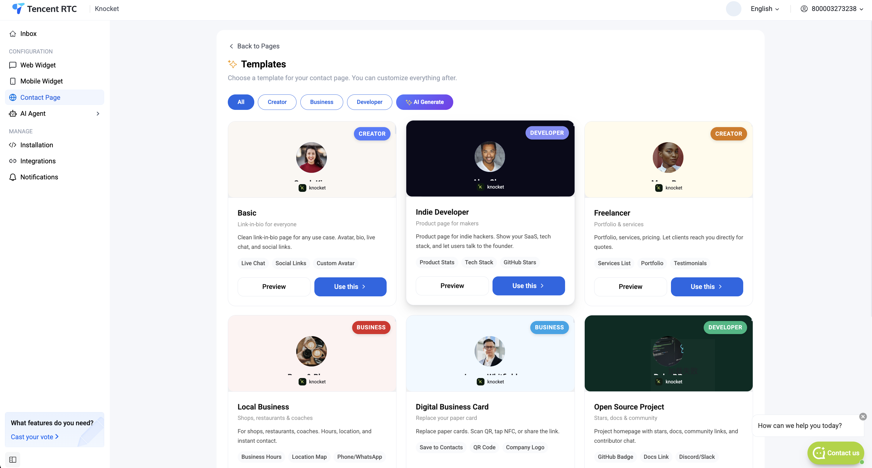
Every template in one grid — good if you're still deciding what kind of page you need.
Portfolio-style layouts for freelancers, designers, and coaches. Features live chat, social links, portfolio grid, custom avatar.
Local business pages — restaurants, cafes, studios. Includes hours, menu / products, booking links, and location.
Product landing pages for indie hackers — product stats, tech stack, GitHub stars, and CTA to try the app.
Same as the AI Generate option in the New Page modal — shortcut to skip the template gallery and prompt directly.
Each template card shows a header preview (avatar + name + tagline), the template category label (CREATOR, BUSINESS, DEVELOPER), a short description, and the blocks that ship pre-installed. Two buttons on every card:
Opens the full-size template preview in a new tab so you can see it end-to-end before committing.
Spins up a new draft page with the template's blocks pre-filled with placeholder copy. You land straight in the block editor.
AI Generate — describe your page
Prefer to start from a prompt? Click AI Generate in the New Page modal (or the AI Generate chip in the template gallery). The generator opens as a two-column screen — prompt on the left, live preview on the right.
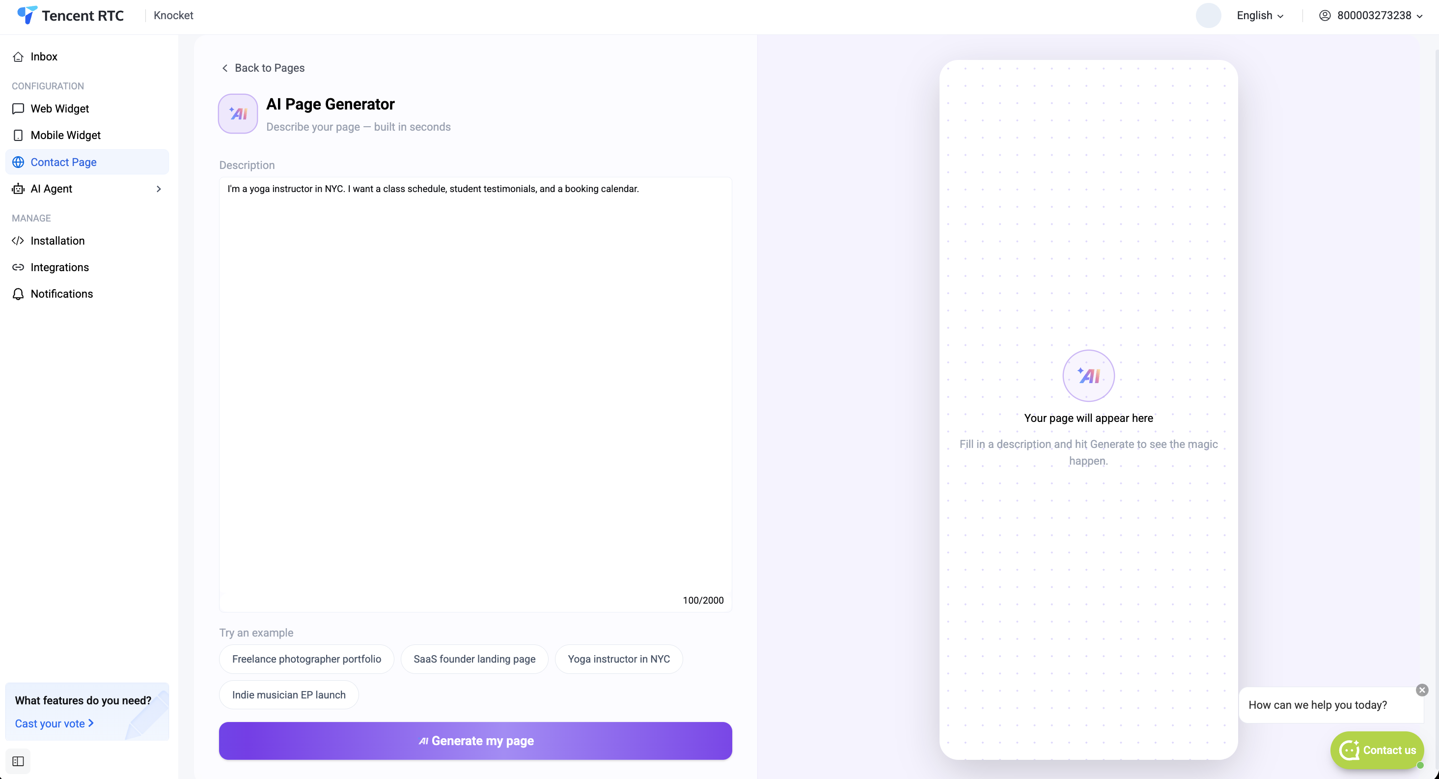
Tell the generator who you are and what you want on your page. One or two sentences is enough. The placeholder shows a sample: "I'm a freelance photographer in Tokyo. I want a portfolio, booking calendar, and social links."
Four pre-written prompts to start from: Freelance photographer portfolio, SaaS founder landing page, Yoga instructor in NYC, Indie musician EP launch. Click any chip to auto-fill the description.
Runs the AI. The right panel shows a spinner then renders the drafted page. Re-run anytime to get a fresh draft from the same description.
Shows the generated page at real render size. Header (avatar, name, tagline), Live Chat CTA, social icons, testimonials, and any category-specific blocks (portfolio for creators, product stats for devs) all appear here.
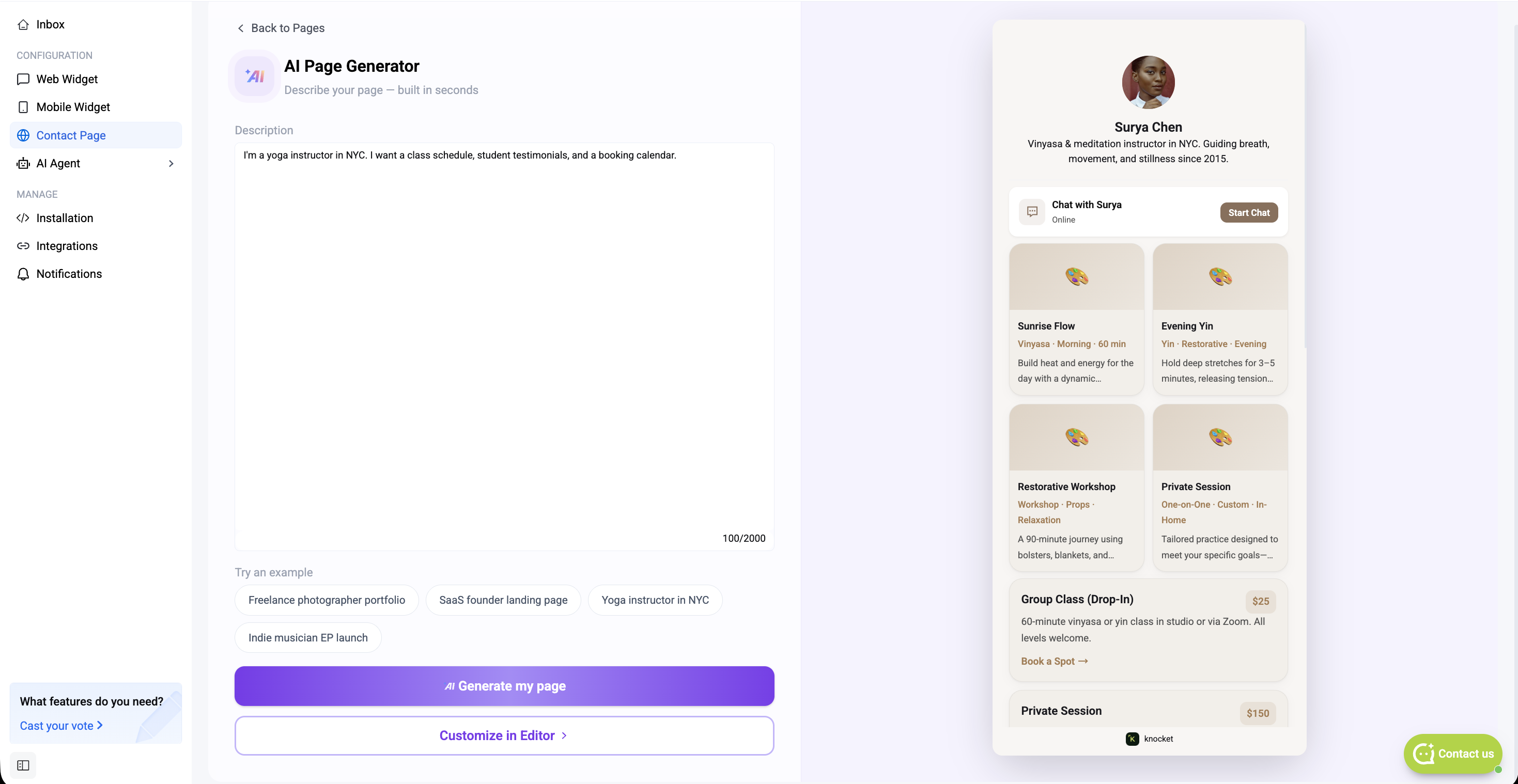
Once you have a draft you're happy with, the two action buttons at the bottom decide where to go next:
Runs the AI again against the same description. Good for exploring variants before you commit.
Commits the current draft, closes the generator, and opens the block editor so you can hand-tune every field.
The block editor
Whether you started from a template or from AI Generate, you land in the same editor: a three-pane layout with the preview in the middle, the block list on the right, and an AI Fill box at the top of the right rail for prompt-driven changes. The top bar shows the template you started from, a Home / Chat toggle, the public URL, and the Save button.
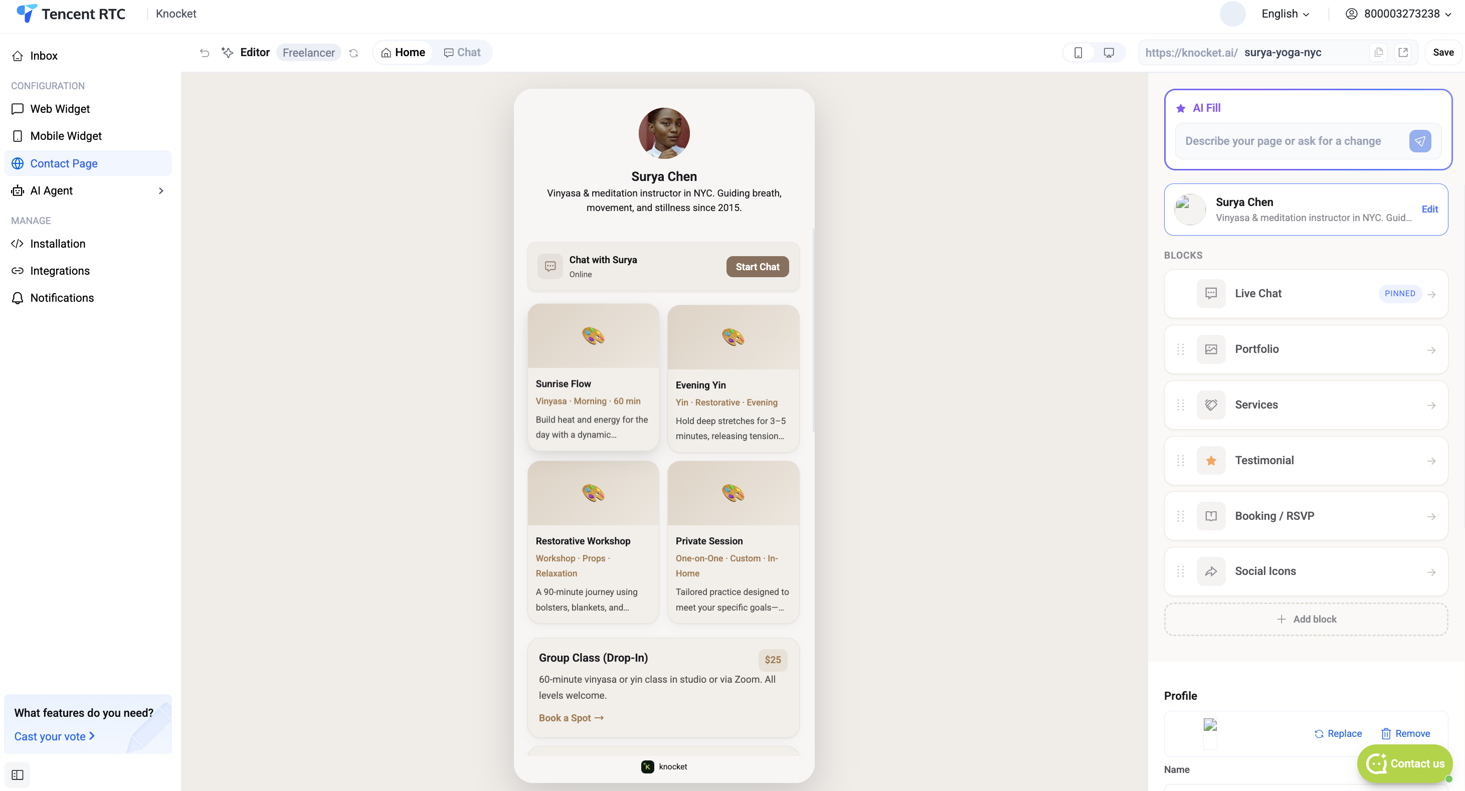
Pages that came out of AI Generate open in the same editor with every block already filled in — copy, colors, portfolio thumbnails, testimonials. You tune what you want and keep the rest.
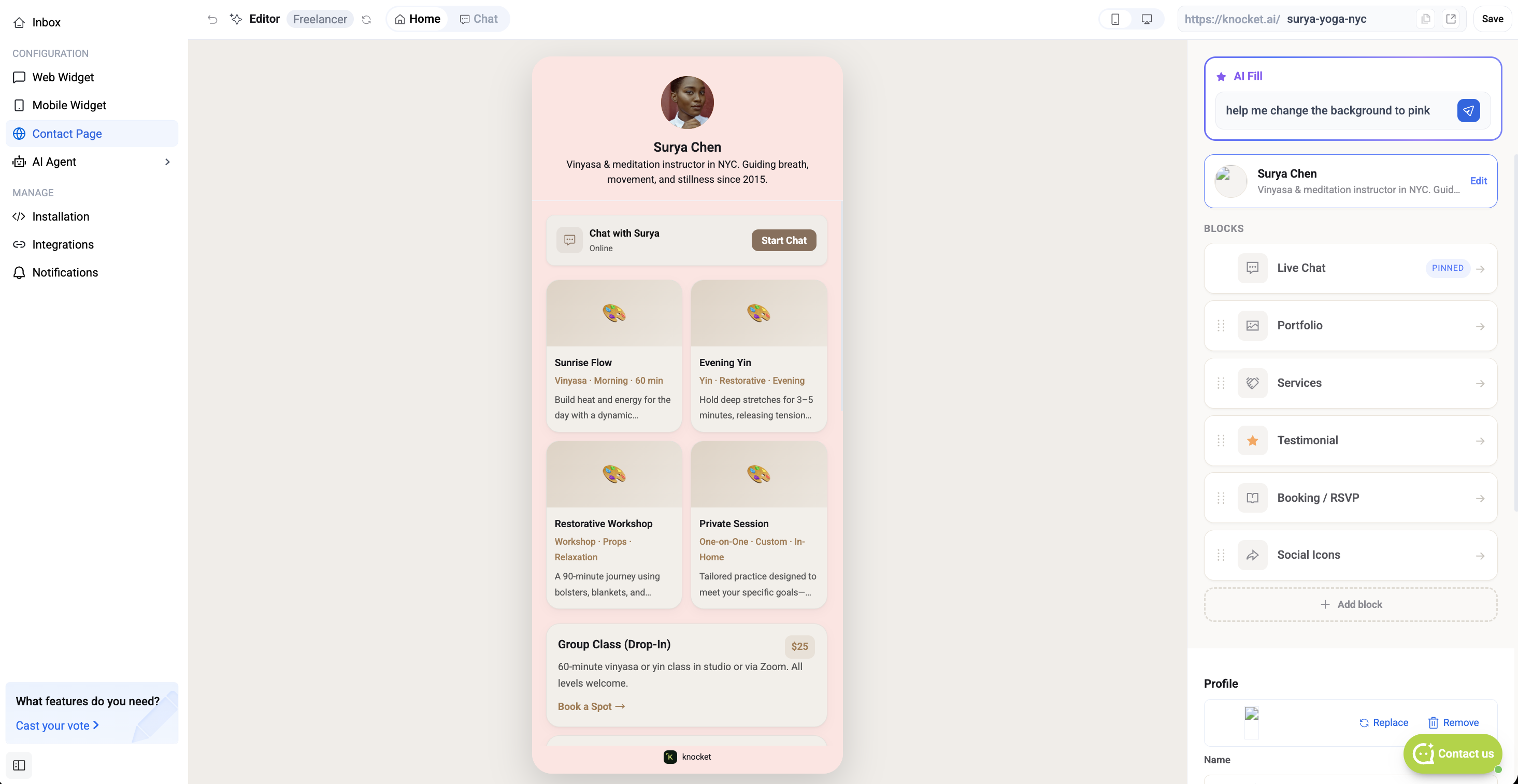
Top bar
Dropdown next to the "Editor" label lets you switch between drafts without leaving the editor.
Toggles the preview between the landing view (Home) and the chat drawer state — useful for previewing what visitors see when they hit Start chatting.
Editable slug for the page — the part after https://knocket.ai/. Change the auto-generated slug to whatever fits your brand (e.g. surya-yoga-nyc). Slugs are globally unique across all Knocket users; the change becomes live the moment you hit Save.
Commits the current state to the draft. Autosave still runs in the background; Save explicitly seals a checkpoint.
AI Fill panel
The purple star box above the block list. Type a request in natural language — "shorten the bio to one sentence", "add three testimonials from small SaaS founders", "make the primary color match my logo (yellow)" — and Knocket rewrites or adds blocks accordingly. Every AI Fill action is undoable.
Header card
The first block right under AI Fill. Click Edit to open its detail panel and change:
Circular profile photo shown at the top of the page. Upload a PNG or JPG, or drop in a URL.
The bold name shown under the avatar. This is what visitors see as "who's on the other side".
One or two sentences of context under the display name.
Block list — every block type
Everything is customizable — every block's copy, accent color, and its position on the page. Click any block to edit its fields inline; drag any row to reorder. Hit + Add block at the bottom of the list to open the block picker.
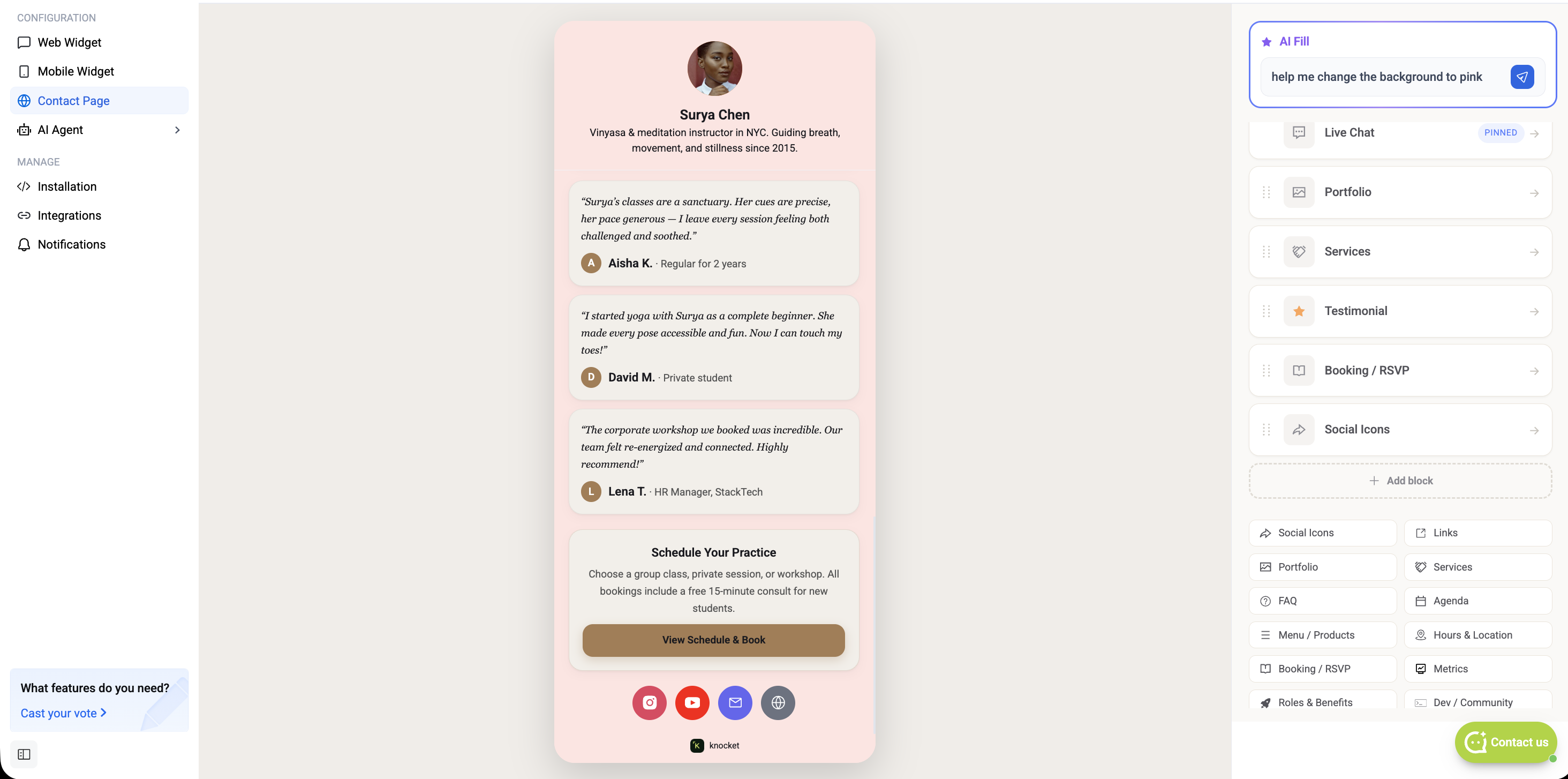
Click any block to open its detail panel — each block exposes its own fields (avatar, quote, author, role for a Testimonial; time, title, subtitle for an Agenda; and so on). Reordering the block list in the editor updates the live preview in real time.
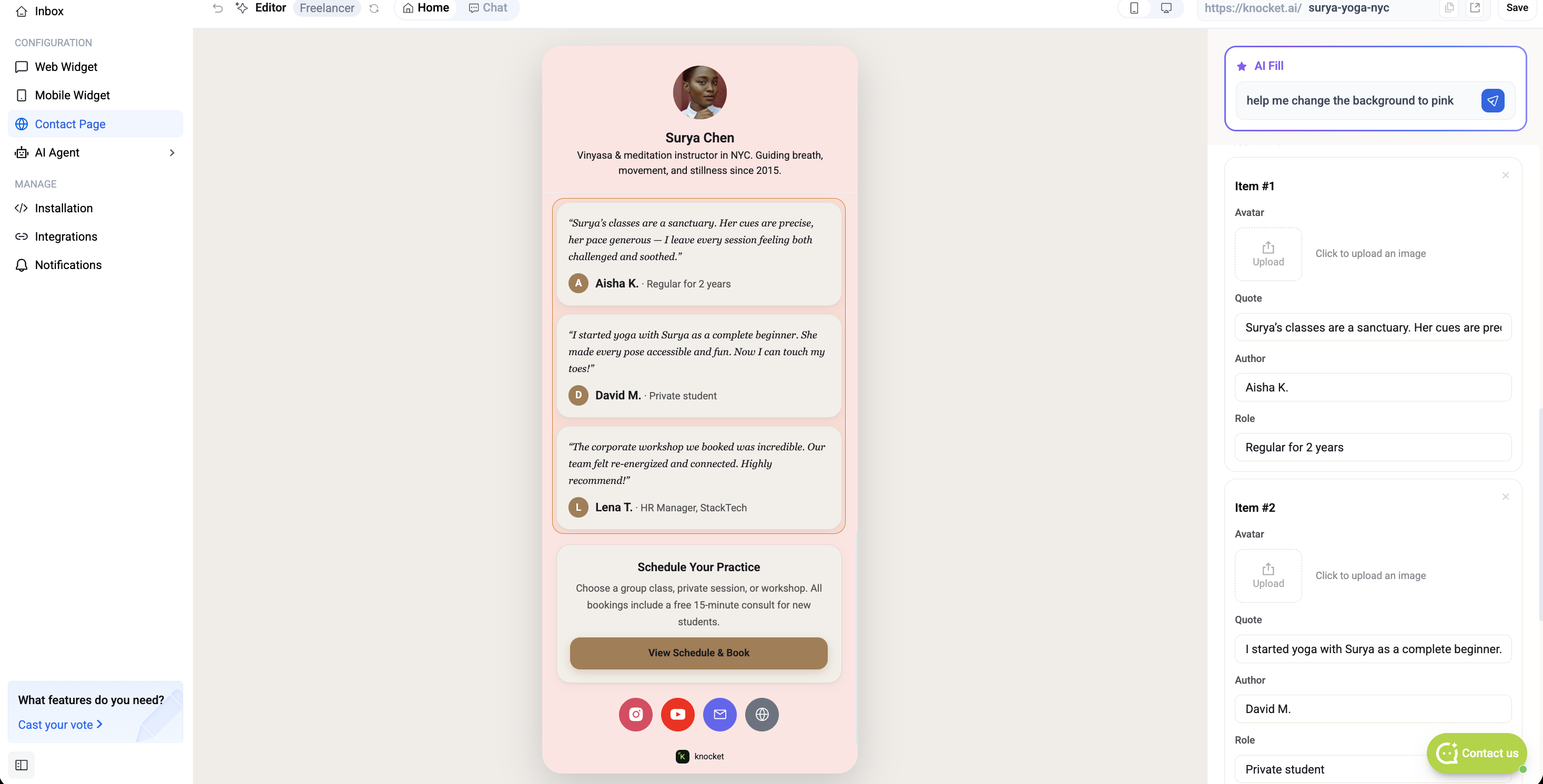
The full block library:
The header entry point that opens the chat drawer. Shows online status ("Online · replies in ~2 min") and a Start chatting CTA. Cannot be removed.
Icon row for WhatsApp, X, Instagram, LinkedIn, TikTok, YouTube, GitHub, Telegram, Discord, and Messenger. Toggle each channel on and drop in its URL.
Image / video grid with captions. Each item has a thumbnail, title, subtitle, and optional link. Good for freelancers and creators.
Collapsible question / answer pairs. Good for pre-sales objections and support macros.
Priced items with images — restaurants, cafes, small ecommerce.
Embed a Calendly link, an event RSVP form, or a manual date-time picker.
Role cards for hiring or team pages — title, description, and a call to apply.
Quote cards with author name, role, and company. Add avatars to raise the trust signal.
Tag-style list of what you do. Useful for freelancers and consultants.
Timeline of past work or projects. Each row has a period, company, role, and short description.
Flat link buttons (link-in-bio style). Each row has an icon, label, and URL.
Priced offerings — each row has a service name, description, and a "from $X" price. Ideal for coaches, consultants, and studios.
Timed schedule rows (talks, sessions, courses). Each row has a time, title, and subtitle.
Opening hours per day, street address, and a map link. Best for local businesses.
Headline numbers (users, revenue, growth, etc.) in a stat-card row.
GitHub stars, contributors, community links. Auto-pulls stats from a GitHub repo URL.
Standalone video or image block with cover, title, and accent color. Covered in detail below.
A scannable QR code of the page URL plus your contact details (email, phone).
Each block ships with sensible defaults — swap the copy, tune the accent color, or drag it to a new position anywhere on the page.
Publish and share
When the page looks right, hit Save in the top-right of the editor. The header shows a checkmark when the draft is committed. Head back to Your Pages and click Publish on this page's card — the old live page auto-unpublishes.
Your page URL sits under the page title — it looks like https://knocket.ai/<your-slug> (e.g. https://knocket.ai/surya-yoga-nyc). Every slug is unique to your account and cannot be claimed by anyone else. Copy the URL and drop it anywhere:
- Link in bio — Instagram, TikTok, X, LinkedIn, YouTube.
- DM / cold outreach — a single URL instead of a form + email + Calendly link.
- Email signature — replace the phone / email / socials chain with one page.
- Business card QR code — the page URL encodes cleanly as a QR.
- Campaign landing — spin up a new draft per campaign and publish the one you're running.
Every message sent from the page lands in the same Knocket inbox as your web widget and mobile widget traffic. No manual channel switching.